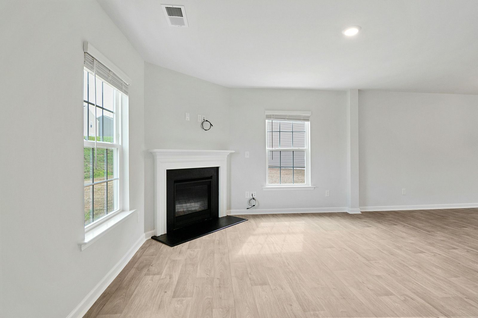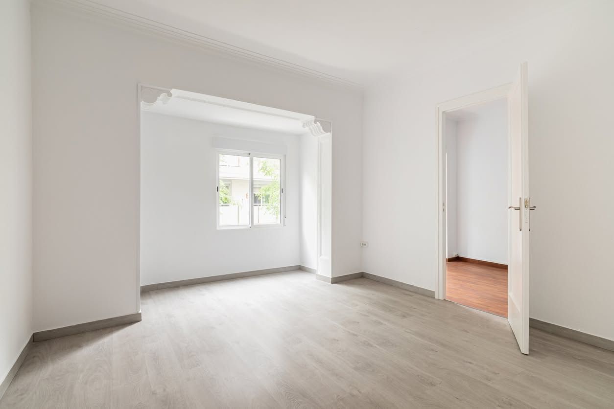
How Trim, Ceiling, and Wall Color Combinations Either Pull a Room Together or Pull It Apart
How Professionals Approach the Same Job
Getting the Wall Ready for Paint After Removal
On service calls we walk the wall surface first, check for hollow spots in the plaster, identify layer count by peeling back a corner, and test the substrate response to a small amount of water in an inconspicuous area. That 10 minute evaluation changes the entire approach.
A wall with loose plaster behind vinyl wallpaper gets treated completely differently than a well primed drywall surface with single layer paper. We use commercial grade steamers for stubborn installations and enzyme based stripping solutions for vinyl adhesive that does not release with moisture alone. After stripping, walls are cleaned of adhesive residue, dried fully, repaired at the substrate level, and primed with the correct product before any paint is applied. Skipping any of those steps is what causes the adhesive ghosting and sheen inconsistency we frequently see on DIY removal projects.
Removal is only the beginning. A wall that has been stripped is not a wall that is ready to paint.
After stripping, the wall surface should be washed down with a clean sponge and warm water to remove all adhesive residue. Adhesive left behind causes paint to fish-eye, peel, and absorb unevenly. Allow the wall to dry for a full 24 hours minimum before any repairs are made.
Repairs should use setting type joint compound for deeper damage and lightweight compound for skim coating and smoothing. Sand with 120 grit before priming, not after.
Primer selection is the most commonly skipped step in DIY preparation. An oil based primer seals the repaired areas, locks down any remaining adhesive residue, and prevents the drywall face paper from raising when the finish coat is applied. This step is not optional. A latex paint applied over an unprimed stripped wall will almost always show adhesive ghosting, uneven sheen, and premature peeling within one to two seasons.
Check walls in high humidity rooms every few months for paint lifting or adhesive bleed-through. Before any painting project in an older home, confirm whether wallpaper was previously installed and factor removal and prep time into your timeline.
TIP: Before you wet a single section of wall, score a small inconspicuous area and try dry stripping. If the paper peels in full sheets without tearing the surface, you have a good installation to work with. If it shreds and takes the wall surface with it, stop and assess the entire wall before proceeding with moisture.
What Makes Wallpaper Removal Harder Than It Looks
WARNING: If you are working with walls that have plaster over wood lath, soaking the wall with a steamer can cause the plaster to separate from the lath keys. This is a structural integrity issue, not a cosmetic one. A wall in that condition can fail in sections. If you feel the plaster flex or hear a hollow sound when you knock on it, stop and get a professional assessment before continuing.
QUICK ANSWER: A room reads as coordinated when trim, ceiling, and wall colors share a clear relationship instead of being picked one at a time. The two reliable paths are contrast (a distinct trim and ceiling color framing the walls) or a tonal, monochromatic scheme where everything sits in the same color family at different values. Trim almost always needs a different sheen than the walls, whether or not it's the same color, because sheen changes how light hits the surface. Ceiling white should be chosen against the wall color's undertone, not picked off a random shelf, since a stark blue-white ceiling can clash with warm walls even when both are technically "white." Getting these relationships right matters more than which specific paint chip you land on.
You walk into a freshly painted room and something feels slightly wrong, even though every individual color looked good on the sample card. The wall color is fine. The trim is fine. But together they read as mismatched, like two people who each dressed well but didn't coordinate. That gap between "good colors" and "a good room" comes down to how trim, ceiling, and wall colors relate to each other, not how each one looks in isolation.
We see this constantly in older Hudson Valley homes, where a single room might have three or four generations of paint choices layered on top of each other. A homeowner picks a wall color they love, then defaults to whatever white was already on the trim, then never thinks about the ceiling at all until it starts looking gray and tired next to the new walls. The fix isn't complicated. It just requires treating the three surfaces as one decision instead of three separate ones.
What Makes a Room Feel Coordinated Versus Random
Every color has an undertone — a secondary color hiding underneath the obvious one. A "white" trim can lean yellow, pink, or blue depending on its base. A gray wall can lean green, purple, or blue. Undertones matter because they're what your eye picks up on when two colors sit next to each other, even if you couldn't name them separately.
Here's the problem: pairing a warm-undertone wall with a cool-undertone trim creates a subtle visual friction. Your brain registers that something doesn't match, but you can't always say why. It's the same reason a "clean" white trim can suddenly look dingy or blue-gray once new, warmer walls go up around it. The trim didn't change. The relationship did.
Designers deal with this by checking undertones side by side, in the actual room, under the actual light, before committing. Paint chip walls at a store use flat, even lighting. Your living room does not. North-facing rooms common in older Colonial and farmhouse-style homes throughout this region tend to cast a cooler, bluer light, which can make a warm trim color look muddier than it did in the store. South-facing rooms do the opposite, washing everything in warmer light that can make a cool gray wall look slightly greenish by afternoon.
Three Approaches That Actually Work
Contrast
This is the classic look: white or off-white trim and ceiling framing a wall color with real depth, like a deep green, navy, or terracotta. The trim acts like a picture frame, and the contrast is what makes it read as intentional rather than accidental. Higher contrast tends to suit rooms with strong architectural detail — crown molding, wainscoting, deep window casings — because the light trim shows off the woodwork instead of blending into it.
Monochromatic, Or Tonal
Instead of contrast, everything sits in the same color family at different values — a mid-tone blue wall, a slightly lighter blue-white trim, a pale blue-tinted ceiling. This approach is forgiving of undertone mismatches because everything is already related, and it tends to make smaller rooms feel larger since there's no hard line where one surface stops and another starts.
Whole-House Flow
This one gets skipped more than it should. Instead of treating each room as its own color puzzle, a handful of coordinated wall colors and a single trim color run through connected spaces — a hallway, a staircase, an open living and dining area. Sight lines in most homes run through two or three rooms at once, so when the trim color changes room to room, that transition point becomes a visual stumble even if each individual room looks fine on its own. Older Hudson Valley homes with narrower hallways and connected first floors show this problem more than open modern layouts do, simply because you can often see three doorways' worth of trim from one spot.
TIP: Before committing to a scheme, paint a sample of the wall color next to a sample of the intended trim color on a piece of white poster board, then move that board to a few spots in the room across a full day. Morning light, midday light, and evening lamp light can shift how the same two colors relate to each other more than most people expect.
Trim Color and Trim Sheen Are a Package Deal
Color choice only tells half the story on trim. Sheen level changes how much light a surface bounces back, and trim almost always carries more sheen than the walls around it — typically semi-gloss or satin against a matte or eggshell wall. That sheen gap is doing real work: it's what separates "trim" from "wall" even when the colors are close, and it's part of why trim reads as crisp and defined rather than flat.
Higher-gloss finishes reflect more light than matte ones, which is exactly why trim painted in the same shade as the wall can still look like a distinct element — the sheen creates a visible line even without a strong color contrast. This is also why trim tends to show flaws that a flat wall would hide. Every dent, sanding mark, or old nail hole becomes more visible under a glossier finish, so trim generally needs more careful surface prep than a wall does before paint goes on. That prep work — filling old nail holes, sanding down decades of built-up paint layers, caulking gaps where trim has pulled slightly away from the wall in older homes as wood shrinks and expands with the seasons — matters more for the finished look than the color decision itself.
Dark or saturated trim colors have gotten more common in recent years, and they can look sharp, but they raise the stakes on prep. A high-gloss black or navy trim shows every surface imperfection under raking light from a window, in a way a soft white trim simply doesn't. If your trim has years of buildup, chips, or uneven old paint, that's worth addressing before a bold color goes anywhere near it.
Getting the Ceiling White Right
Ceilings get treated like an afterthought more than any other surface in the room, and that's a mistake. A flat, standard "ceiling white" is usually the right call for reasons that have nothing to do with fashion. Flat finishes scatter light instead of reflecting it directly, which hides the small imperfections that ceilings tend to accumulate — old texture, minor settling cracks in plaster ceilings common in pre-1960s construction, patch marks from fixture changes. A glossier finish overhead would put every one of those flaws on display.
But "ceiling white" is not one universal color. White paints span a wide range of light reflectance values, generally somewhere between the low 80s and mid-90s on that scale, and even within that narrow band, undertones vary the same way they do in any other white. A cool, blue-leaning white ceiling over warm cream walls can look like a mismatched afterthought, almost gray by comparison, even though both are technically "white." The better approach is choosing a ceiling shade with a whisper of the wall color's undertone mixed in — sometimes as little as 25 percent strength of the wall color — so the ceiling reads as part of the room instead of a slab of leftover primer.
Ceiling height plays into this too. Lower ceilings, common in older farmhouses and Cape Cod-style homes throughout the area, can feel even lower under a stark white that creates a hard line where the wall stops. A ceiling color with slightly more warmth, or one that's just a few shades lighter than the wall rather than a jump to bright white, can soften that transition and make the room feel taller than it is.
WARNING: Skipping primer when jumping to a very different ceiling color, especially going from a dark or discolored ceiling to a bright white, tends to backfire. Old ceiling stains — nicotine, water marks, smoke — bleed through standard paint even after two coats, especially once humidity rises again the following summer. A stain-blocking primer applied first prevents that ghosting from showing up months after the job is finished.
How We Approach a Color Plan Before the First Coat Goes On
When we walk into a room before a paint job, we're not just looking at the wall color someone has in mind. We're looking at the trim condition, the ceiling's current state, the direction the windows face, and what's happening in adjoining rooms that share sight lines. A house built in the 1920s in New Windsor or Cornwall behaves differently under paint than a 1990s build in Wappingers Falls — older plaster walls and original trim profiles catch light differently than modern drywall and machine-milled molding, and that changes how a given color combination will actually look once it's up.
Surface condition drives a lot of our recommendations too. Trim that's been painted a dozen times over decades often has buildup around joints and hardware that needs to be addressed before a new color, light or dark, will sit cleanly. Ceilings with plaster cracks or old water staining from a since-repaired roof or gutter issue need the right prep and primer before color even enters the conversation, or the new paint will just highlight the same old problems. This is where our broader work outside of pure painting comes in — drywall and plaster repair, addressing the water staining that a gutter problem left behind, or getting a ceiling properly patched before it's painted — because color decisions only hold up if the surface underneath is sound. A striking trim color on trim that's still cracked at the joints won't look finished no matter how carefully it's chosen.
We also walk clients through how a scheme will look in the specific light their home gets, not a showroom. A color combination that looks balanced in a south-facing sample room can shift noticeably in a north-facing hallway two doors down, and accounting for that before paint goes on saves a repaint later.
Frequently Asked Questions
Should the ceiling always be a different color than the walls?
Not always, but usually a slightly different shade. Exact matching can work in very high-ceilinged rooms, but in standard-height rooms, some distinction between wall and ceiling helps define where one surface ends and keeps the room from feeling flat.
Does trim have to be white?
No. White trim is common because it coordinates easily, but colored or dark trim works well too, especially where architectural detail deserves highlighting. The tradeoff is less forgiveness for surface flaws, since darker, glossier finishes reveal imperfections a soft white would hide.
How do I know if a color has a warm or cool undertone?
Compare it against a neutral gray or white card in natural daylight. Pulling toward yellow, orange, or red means warm; pulling toward blue, green, or purple means cool. This matters most once the color sits next to trim or flooring.
Can I use the same trim color throughout the whole house even if wall colors change room to room?
Yes, and it makes a home feel intentional rather than pieced together. Consistent trim and ceiling across connected rooms let wall colors give each space character while the trim ties sight lines together.
Why does my trim color look different than it did on the sample?
Lighting is almost always the reason. Store lighting, daylight, and lamp light render color differently, and a flat sample chip can't match trim wrapped around windows and corners. Painting a larger sample in place gives a truer read.
Is it a problem to mix warm and cool tones in the same room?
It can create visual friction, but it's not an automatic mistake. Some strong color schemes deliberately pair warm walls with cooler accents. What separates that from an error is whether it was chosen on purpose and tested in the room's actual light.
Why Trim, Wall, and Ceiling Have to Agree
The gap between a room that looks coordinated and one that looks accidental rarely comes down to any single color choice. It comes down to whether trim, wall, and ceiling were treated as one decision or three separate ones, and whether undertone, sheen, and light were accounted for before the brush ever touched a wall. A scheme that respects those relationships holds up in every room it's viewed from, not just the one where the sample chip was tested.
Jerry's Refinishing has spent 30
years reading how
trim, ceiling, and wall colors
actually behave in homes across New Windsor, NY and the Hudson Valley, from 1920s plaster to modern drywall. That experience shapes every color plan before a single coat goes on, accounting for the light a room gets, the condition of its surfaces, and how sight lines carry a scheme from one space into the next.